Page 1 of 5
Changes
Posted: 04 Nov 2013, 10:37
by Pluggy
As you are probably aware, I'm getting a professional involved to sort out OGFB. It will be made MUCH simpler and closer to its base software, this is necessary for the long term maintenance of the site to be viable.
Expect changes and downtime, I'm going to contact the guy today to start the job, I'll endeavour to keep you informed. The Arcade and Portal will cease to exist among a lot of smaller changes.
Re: Changes
Posted: 05 Nov 2013, 05:18
by Stanley
Good! Go for it. Any downtime will be a small matter to cope with compared with the trauma of losing the site. It will be nice to see the LTP functioning again. Once it is up I can promote it again.
Re: Changes
Posted: 05 Nov 2013, 08:34
by Cathy
Not sure what it will mean if the Portal doesn't exist...? Probably something technical that doesn't mean what I think it means. Guess we will soon find out.
Re: Changes
Posted: 05 Nov 2013, 09:05
by Wendyf
Just the front page Cathy, the way into the site. Doc tried to make us feel comfortable by having a front page that looked as similar as possible to the old site.
Re: Changes
Posted: 05 Nov 2013, 09:14
by PanBiker
I think we should add that after the changes, users will come straight to the forum page to log on. Personally, I bookmark this page for the site, I very rarely visit the Portal as it has no use.
Re: Changes
Posted: 05 Nov 2013, 09:25
by Pluggy
I'm still awaiting a reply from the php programmer who convinced me he was the way to go.
Re: Changes
Posted: 05 Nov 2013, 09:53
by Cathy
quite sure it will all work out beautifully.
Don't stress.

Re: Changes
Posted: 05 Nov 2013, 15:00
by Tizer
The present Forum page is far too complicated, littered with titles and links to subforums with next to nothing in them. I hardly ever go there, probably only when I want to start a new thread/topic 'cos I don't know anywhere else I can do that. I always go straight to Active Topics but I've got to be logged in to be able to access it.
Re: Changes
Posted: 05 Nov 2013, 15:38
by PanBiker
I have already deleted evey Category, Forum and Sub-forum that does not have any content. What remains will be further simplified after the site has been rebuilt. It would not be prudent to do any moving and merging with the current instability of the database.
For the record I have deleted about 50% of the content on the forum page. Further pruning will be immediately apparent after the rebuild as all the add on's at the bottom will no longer be there. Ultimately the site will have a much simpler structure and should be a lot easier to navigate. I will also hopefully make it easier for users to suggest new categories or forums.
Re: Changes
Posted: 05 Nov 2013, 16:54
by Pluggy
I've had a reply from Martin Litvaj, he's starting work in earnest tomorrow. It was his birthday yesterday, hence no reply to my email.
Re: Changes
Posted: 05 Nov 2013, 18:15
by Pluggy
He's suggesting we have a background main picture like this:
http://acs.cz/index.php Its a board he's set up recently. We'd need a big picture of the town square or something 'Barlicky' at least 1500 pixels wide. Its the wrong time of year I think to take a new one.
Re: Changes
Posted: 05 Nov 2013, 18:40
by PanBiker
Personally I think the top banners will be fine, there is one missing at the moment but we have the option to change these relatively easily.
The design of the forum on the link is fine but I cant see the point of a big image if you can only see the edges!
Re: Changes
Posted: 05 Nov 2013, 18:54
by Pluggy
OK, we need a big picture that has the important stuff at the edges.
I wanted the Town Square picture but it would force the content too far down the page. I've said forget it for the time being, he has work to do repairing the database before we get to the aesthetics. The banners will be there in a rotating sequence. He's also suggested a theme other than Prosilver 'to look nice'. I said its open to consideration.
Re: Changes
Posted: 05 Nov 2013, 20:22
by Tizer
If you use a background pic like the Polish (?) site then I guess it would have to be rural rather than Barlick town as so much is hidden. I'd suggest giving priority to the text over the pic and having full page width posts or at least an option for it. White text on black background is a no-go for a web site with older, `visually challenged' members (like me!). But it's very impressive nevertheless!
Re: Changes
Posted: 05 Nov 2013, 23:08
by Big Kev
You're more than welcome to use any of my pics (the "Town Square" pic is one of mine), I have a few. The panorama shot, below can be cut down to suit if you're looking for something rural.
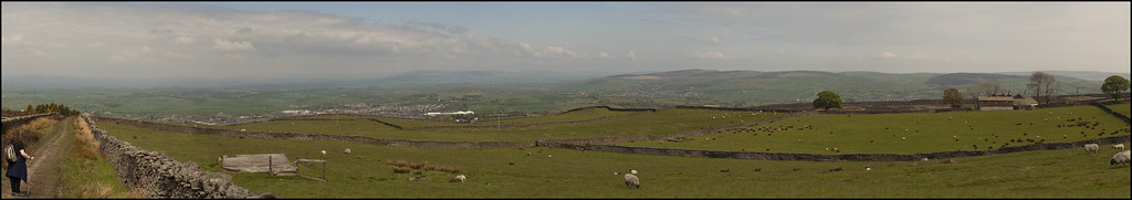 From Weets
 by
Olympus_Kev, on Flickr
Let me know what you're after and I'll see what I have.
Cheers
Re: Changes
Posted: 05 Nov 2013, 23:40
by PanBiker
We have one missing from the loop Kev so a replacement would not go amiss. Best let our chosen expert do his stuff first though and get the platform stable again.
A change of view from time to time is not a bad idea anyway I think. I'll give you a shout when we are ready and thanks for the offer.
Re: Changes
Posted: 06 Nov 2013, 04:50
by Stanley
In my opinion the site colour should be left as it is for the time being. Why pile change on change? Make the transition as seam;less as possible. Time for tweaking when everything is bedded in.
Re: Changes
Posted: 06 Nov 2013, 08:50
by Pluggy
Kev, could you email a copy of the panorama you posted from Flickr at full resolution to me (webmaster....) please. It would make an excellent replacement for the missing banner. Downloads are disabled on flickr.
All your comments are noted, He will build a new version of OGFB which we can look at before the old one is removed and the changeover made. Its non destructive. The background picture is only an idea. I know you're a conservative lot

Re: Changes
Posted: 07 Nov 2013, 05:21
by Stanley
Less of the conservative! What we are doing is attacking the status quo which is not fit for purpose!
Re: Changes
Posted: 08 Nov 2013, 07:56
by Big Kev
Pluggy wrote:Kev, could you email a copy of the panorama you posted from Flickr at full resolution to me (webmaster....) please. It would make an excellent replacement for the missing banner. Downloads are disabled on flickr.
Flickr downloads should be enabled now, any problems let me know.
Cheers
Re: Changes
Posted: 08 Nov 2013, 08:14
by Pluggy
I got your PM Kev.
There is a delay with the big change. the damage to the database is what holding things up.
Re: Changes
Posted: 08 Nov 2013, 09:12
by Gloria
Pluggy, when I click on your link I don't get any background picture, just the site content.
Anything you all do re-jigging this site is fine with me. I am sure all will be well in the end.
Re: Changes
Posted: 08 Nov 2013, 17:03
by Pluggy
Gloria wrote:Pluggy, when I click on your link I don't get any background picture, just the site content.
Anything you all do re-jigging this site is fine with me. I am sure all will be well in the end.

The 'AC Sparta' site looks like this, its possible it looks different on an old school 4:3 screen. The football stadium is the background picture.
Re: Changes
Posted: 08 Nov 2013, 17:07
by Tizer
I use a 4:3 screen and the site looks like your picture, Pluggy, i.e. I see what you see.
Re: Changes
Posted: 08 Nov 2013, 20:22
by Gloria
Where there is a picture behind the wording on yours, mine just has black. Odd!!!!